
Page layout inspo
Overview:
typography
black and white text ONLY
white space
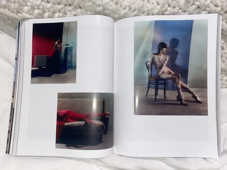
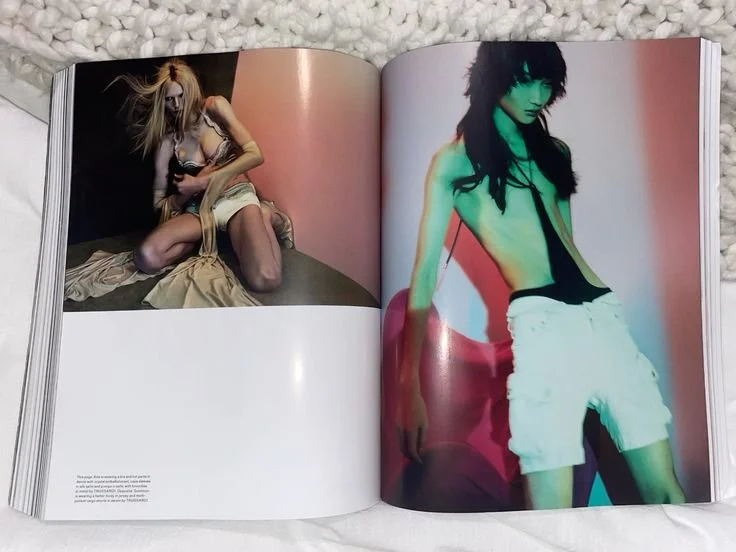
full page image spreads

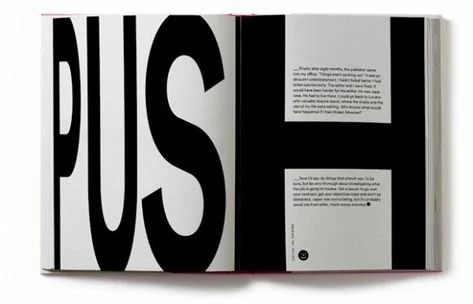
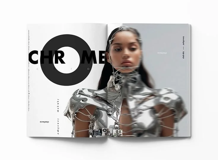
Typography
While the photos are the centerpiece of the magazine, it's essential to embrace creative and experimental typography to enhance the visual appeal, minimizing the need for excessive effects in the layout.
BLACK AND WHITE TEXT ONLY

Using white space effectively will be a key technique for generating visual interest without overwhelming the design or distracting from the main focus.
white space

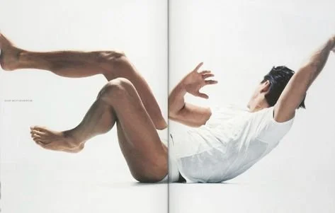
full page image spreads
I’d like to feature full-page image spreads throughout the zine. The use of white space and layout will be up to your creative vision as a graphic designer, but remember that the image should remain the main focus.
Aim for about 50% of the zine to consist of full-image spreads.
Feel free to experiment with image cropping!